25. Jul, 2021
We don't half love a football kit in Hull...
In my eyes Hull's both strength and weakness as a city is that it swims against the tide of culture quite a lot.
Not just famously turning away the King from the entering the City walls.... but more than that.
I think this is predominantly because it's an outlier in terms of geography it's got a culture of its own... therefore independent shops and providers were much more prevalent, as is food, language... also how can I put it politely? Viewpoints?
For someone who has been to the City every few weeks my entire life I honestly don't think people who live and stay in the city see how different it is to other places of similar size.
You may be wondering, not for the first time, what the bloody hell I'm babbling on about.
Here goes....
Irrelevant snippet number one.... Fashion in Hull growing up was different to other areas. I remember seeing the casual style in Hull at games in the eighties, lads in Farahs, Adidas Sambas or Gazelles and Pringle or Lyle and Scott jumpers. I was living in the south of England by then and remember being influenced by this style, meanwhile the Home Counties were not influenced by this look at all. In middle school I think the kids all thought that weird northern lad was in fancy dress. Even now when I'm in the city I go to a couple of independent clothes shops, I like this element of Hull's independence. Which takes me to kits....
We love football kits, as a fan base we are verging on obsessed with it. Announce anything as a club and fans will tweet underneath the admin imploring them to launch the new kit. There's a connection here, I'm making a bit of a leap of faith, but in Hull the fans are particular about football related attire and fashion. We had an entire artistic display in the city of our kits thanks to the guru of all matters Hull City kits Les Motherby and although I'm not sure anyone could physically match Les's encyclopaedic knowledge I know many, many fans who just love City kits.
Irrelevant snippet number two...I once sent Les a pair of socks from the 1999/2000 season to complete a kit, I'm not sure how much he wanted 20 year old socks, but I figured someone who had worked so tirelessly to put together a collection of that much detail would be better off in charge of said socks than me.
Which takes me back to kits, I love the new away, and it seems very popular amongst the fan base judging by pre-orders. So I thought it's a good time to share my personal favourite away shirts (including some third kits) of recent years.
My mate growing up was a Watford fan, he'd always say that despite the fact their yellow and black shirts didn't really match a pair of jeans as a fashion item, it looked impressive if there's two thousand of you in an away end. He pointed out that the Holland away end looked better than say France. He has a point. City also has this in their locker. But maybe because our home kit is (despite the cult examples) less alluring at times as a fashion item, we really do like a set of change colours.
Irrelevant snippet number three, the folks in the club shop have told me the current ownership have a lot of input in the current kits, they don't like an away that's not white or black and only allow "different" third shirts. * Tin hat on * I actually think our shirts have been pretty good for a few years now. Alongside the academy development, maybe this is a second area that they've got right, badge notwithstanding. (My blog had been going well until now... sorry!)
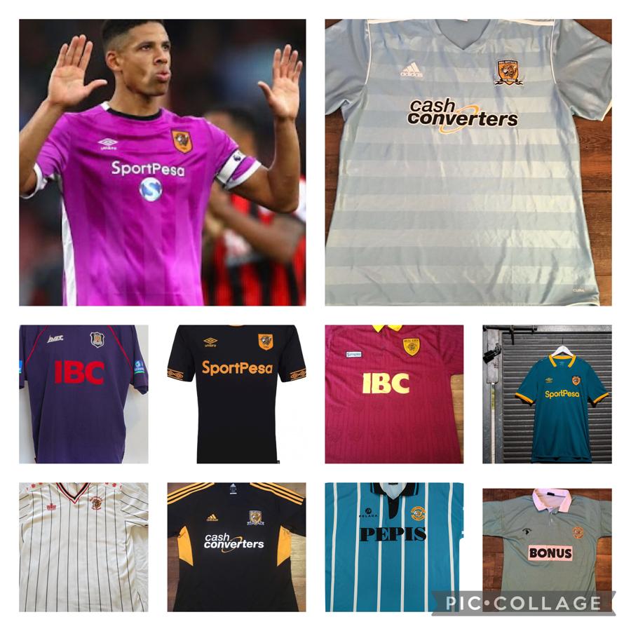
Ok, here's my favourite, non-expert shirts of recent times. Apologies if the years are slightly out, I think most are right.
Remember dear reader... I'm no expert... in the featured picture, from the top, from left to right.
- The Cactus Purple third shirt of 2016.
Boy this was lovely. Loved the colour, the fit was simple, it's great to wear, we've never had that colour. The downside? We played in it twice (Curtis is apologising for the first game after we made Bournemouth look like prime Bayern Munich) and lost twice. It definitely wasn't lucky.
2. The 2012 Sky Blue away shirt.
The Adidas era was a little hit and miss at times, but this shirt was cracking, the different tones on the panels and the simplicity again was also awesome. Although Paul McShane's red barnet didn't half clash against it.
3. The 1999 purple away shirt.
Because... Theo... Yes, it hasn't maybe aged as well as some and it was apparently made from the same material that priests are punished with, but the dark purple top was beautiful. A top that a red sponsor and the Sheffield Stealers badge couldn't spoil. Quite an achievement.
4. The away shirt of 2018
There's been several great black away shirts, but this one really was something special, the all black look with shorts and socks was class, the amber Umbro trim was ace, the collar was cool and the fit was really nice. Plus we rocked up at Leeds in it and ruined their Christmas.
5. The away shirt of 1995
Another kit that was even better because of the shorts, the all burgundy was lovely. In that era I was a bit obsessed with Italian kits and had a Torino shirt, this was the nearest thing to it. I do miss fold down collar on kits in the recent era too. This shirt was cracking. A shame about most of the players who wore it.
6. The third kit of 2019
Yeh, it was a really strange story about how we got a third kit based on the faded paint of the world's smallest ticket office, yes the dark blue shorts were a bit strange do. But... as a shirt, it's a thing of beauty. Such an original colour, works beautifully with the trim and the king Norbert Balogh wore it, and then got injured and that was just about it for him. Spectacular.
7. The away shirt of 1987
Jumping back in time a little. The previous admiral away was lovely, but the subtle red infused into the 87 version made it possibly even better. I'm sure we ended up wearing red shorts a couple of times with it too. Plus Skipper and Jobson wore it and Garry Parker with a massive mullet. Immense.
8. The third shirt of 2012
Was never a fan of the home in this era. Bit yellowy for me and very bog standard Adidas, the away and third were incredible though and maybe Adidas's finest hour. We made the pale blue the third kit in this era I think so it could just be the away, I may need correcting. The all black was awesome, we looked like the sort of side that would be promoted in the last second of the season, so we did just that.
9. The away shirt of 1994
Another shirt that wasn't the easiest to wear but it was aesthetically lovely. The Napoli blue was great and even with about three sponsors stuck over the top as we were poorer than a church mouse you couldn't spoil it. Plus you could always tell your mates we’d been sponsored by “Pepsi” that year, which I definitely did.. I had this shirt and somewhere, moving house, or something, it's gone. "Alexa...show me an example of tragedy"
10. The away shirt of 1991
Maybe my favourite. The green and white "shop-a-check" green was really original for the era. The collar and press stud button made it even smarter and from a distance it was mint green. Iconic and beautiful, if I had any children I'd sell them to gain this shirt...
Hopefully a few of you good folk can add your favourite shirts on to this twitter thread and we can all have a good natter about kits. I'm excited about the third kit this year already!
Thanks for reading. UTT